Luceco
Animation and branding
At Luceco, a lighting and power solutions company, I self-taught myself 2D and 3D animation, creating product videos for trade shows, exhibitions and social media. These required storyboarding, kinetic type and use of stock music, as well as an understanding of how to encode video for different screen specs. I then shared what I learned with colleagues and oversaw the development of product videos.
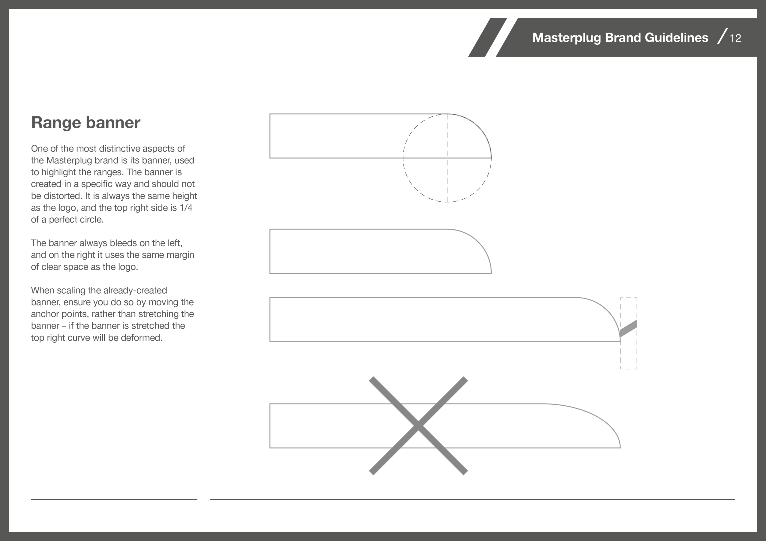
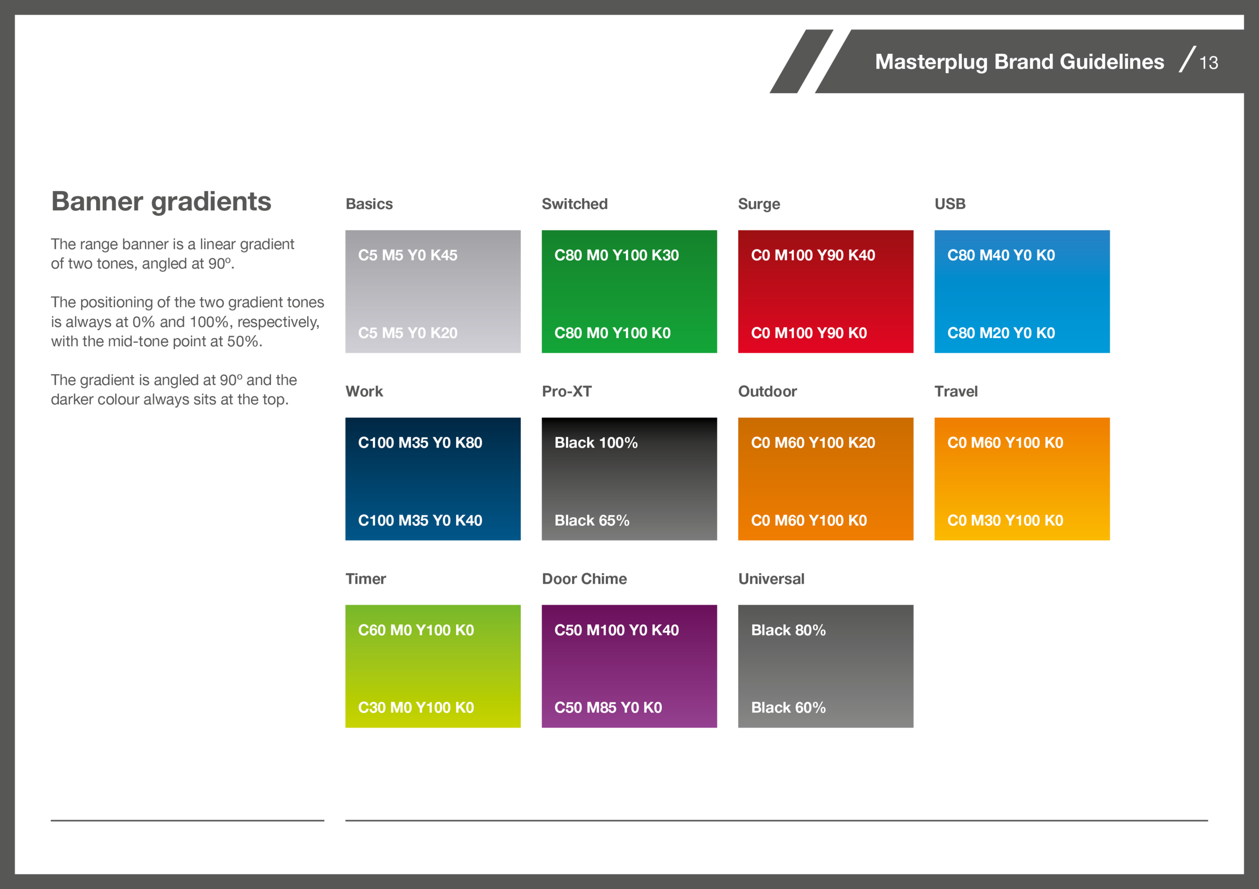
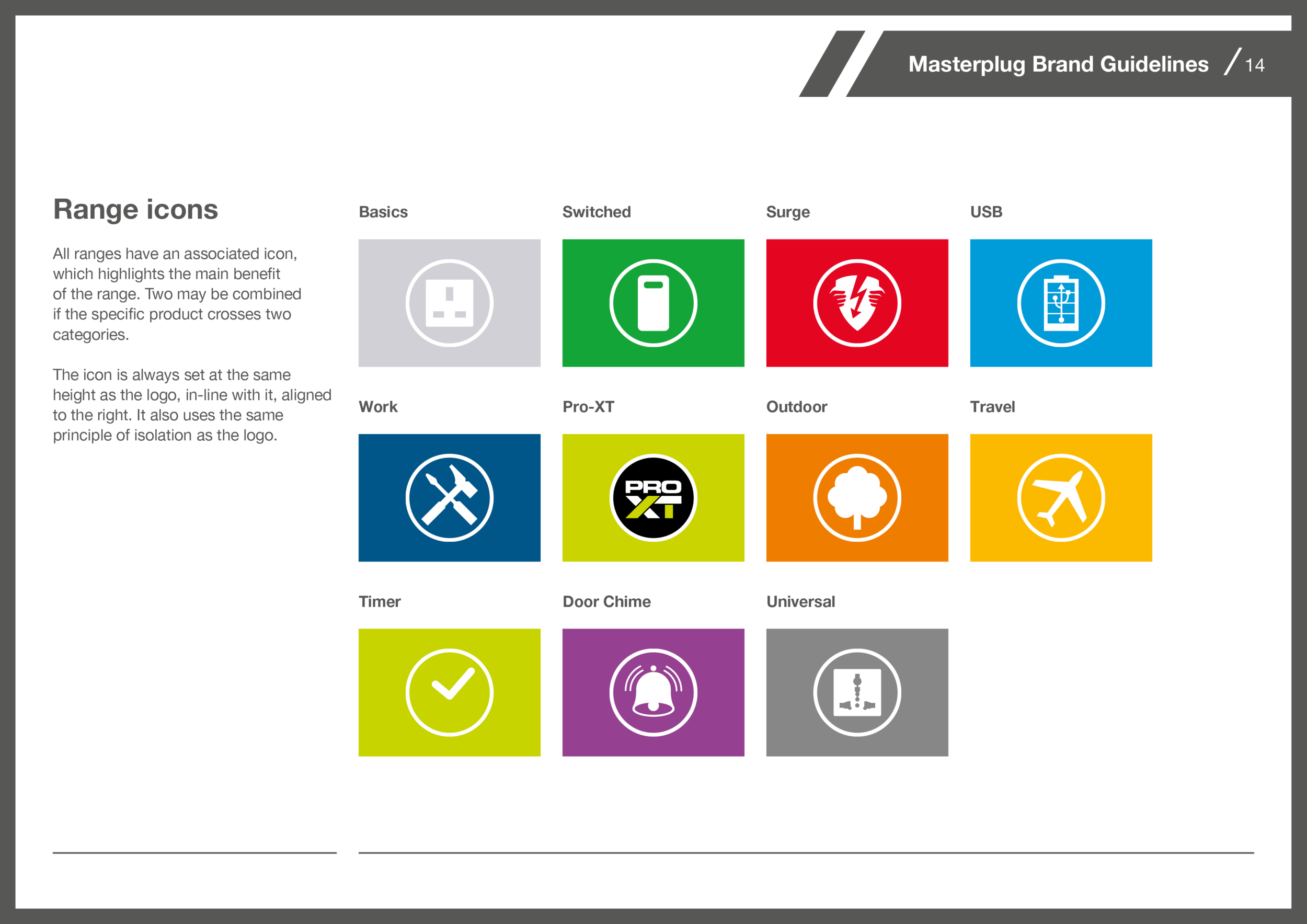
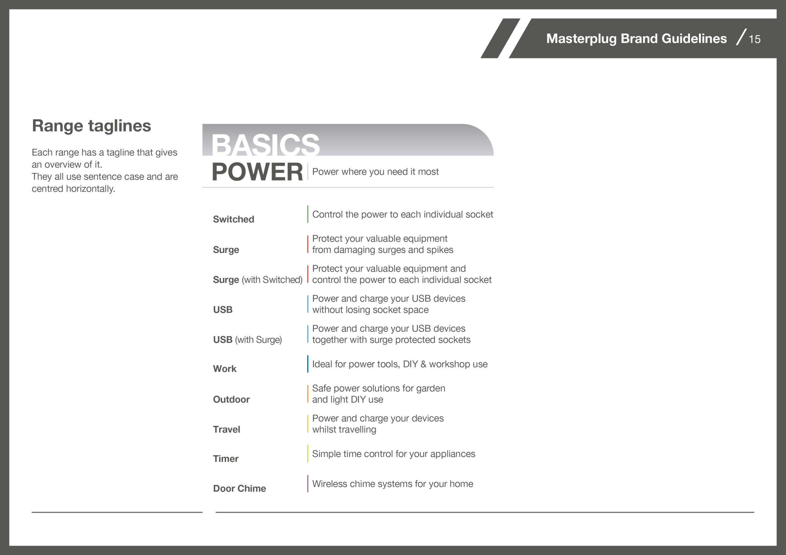
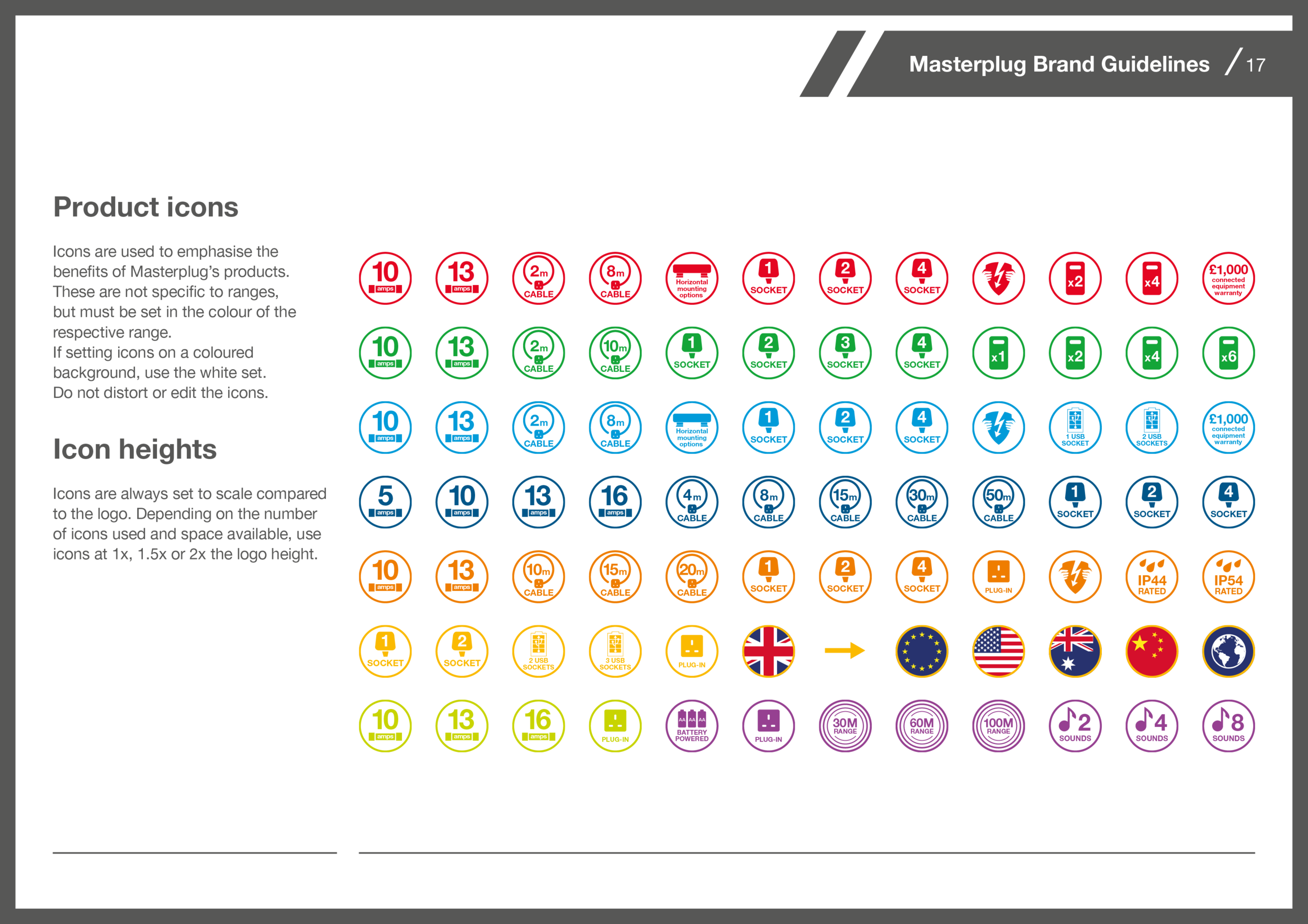
I also created brand guidelines for Masterplug, one of the company's brands, bringing brand and packaging consistency across the production factory and global sales teams.
To create the videos I started by developing an understanding of the products, its features and benefits, and then developing a storyboard. I would explain the animation concept as clearly as possible to the creative director, and together we would finesse the story. Once we were aligned in our plan, they would approve the storyboard. I would then gather and develop all the assets needed.
Using the production source files I rendered the products as realistically as I could using Keyshot, which I also used to animate them. Where necessary, I created environments using SketchUp, and also brought them into Keyshot, where I rendered all the 3D elements I needed. I then put the animations together in After Effects.
Masterplug brand guidelines
Masterplug, one of Luceco’s brands, offers power solutions. All of these products required packaging and, after a few years of loose oversight, the design was lacking consistency, and the brand was suffering as a result.
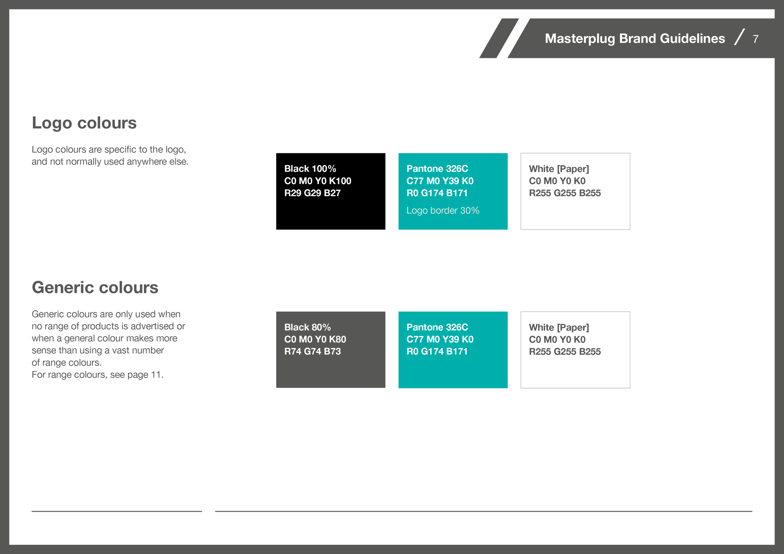
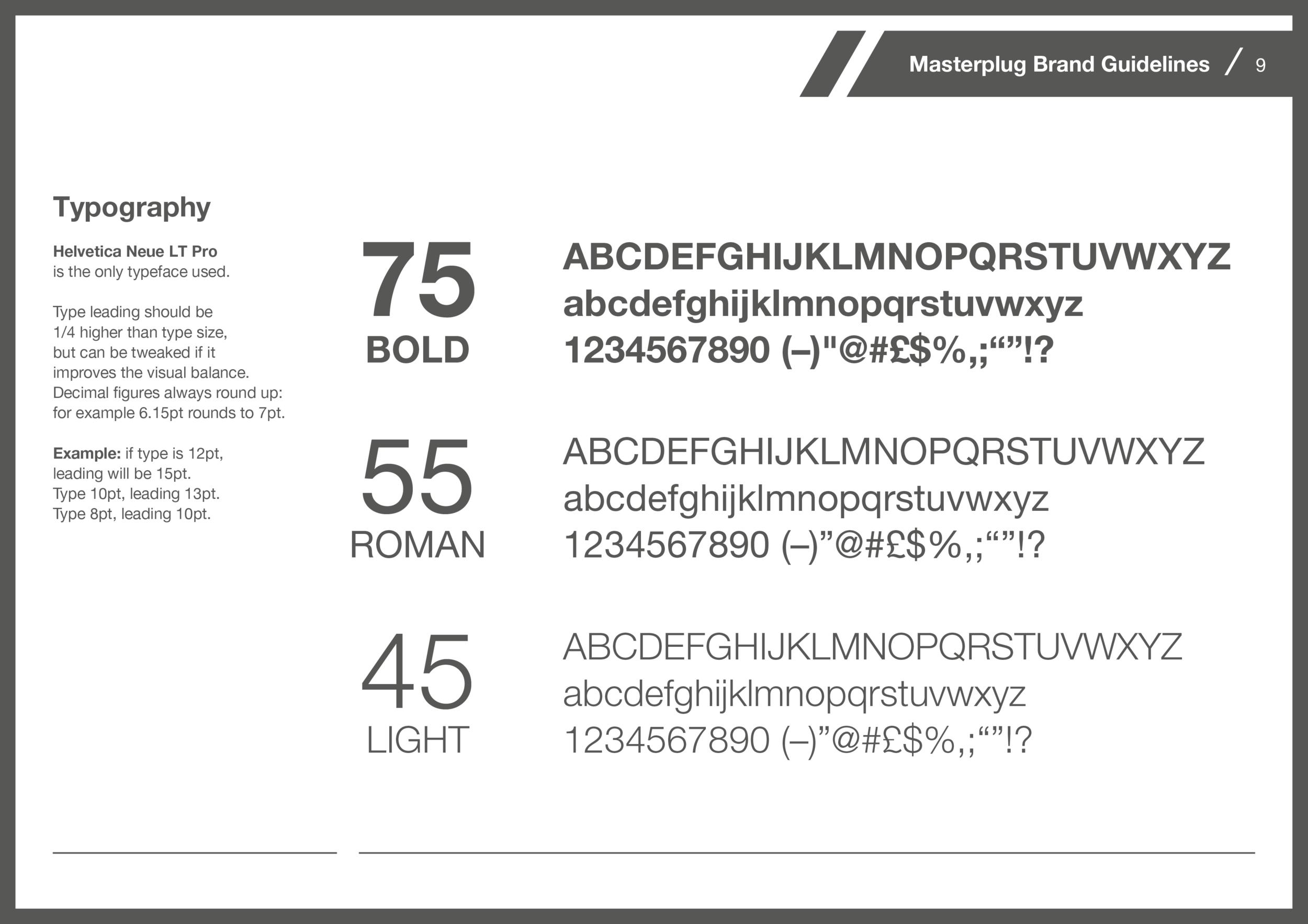
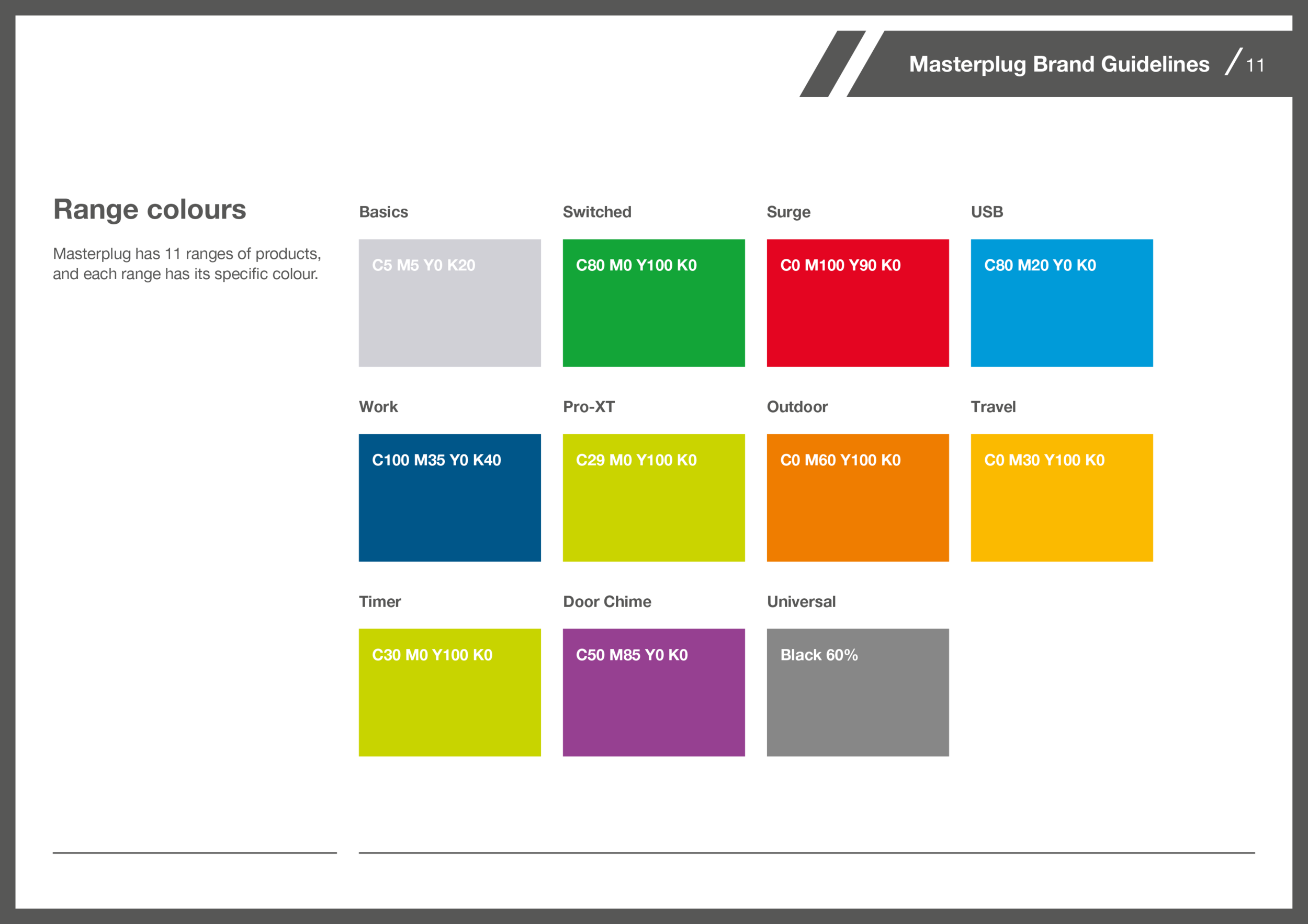
There was no sense of scale on the varying package sizes, different typefaces were being used, and colours were inconsistent within the same product categories.
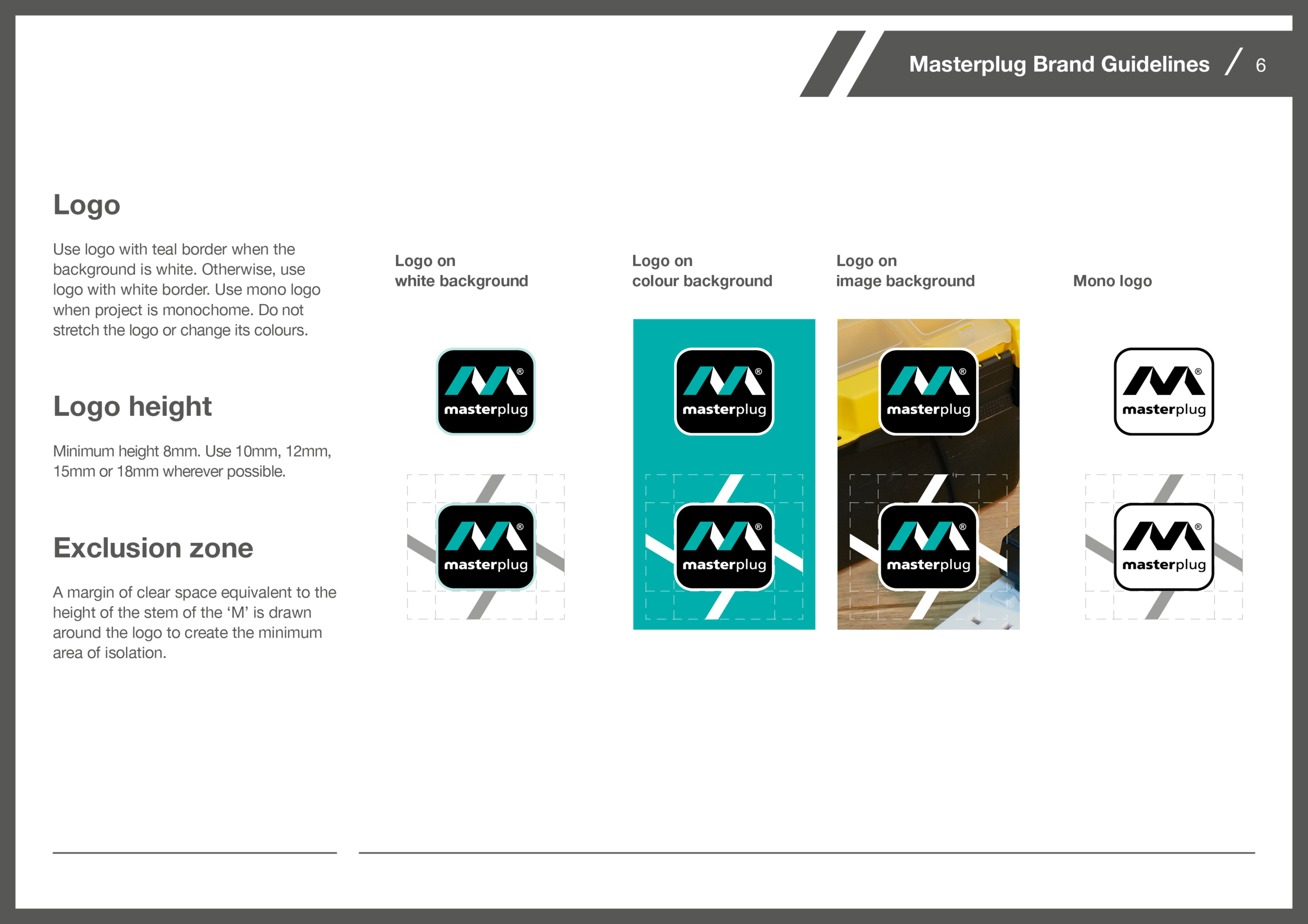
I developed a set of brand guidelines that brought consistency, and working closely with the factory teams in China we applied these and brought consistency across the brand, whilst simplifying the process of developing new packaging as well.
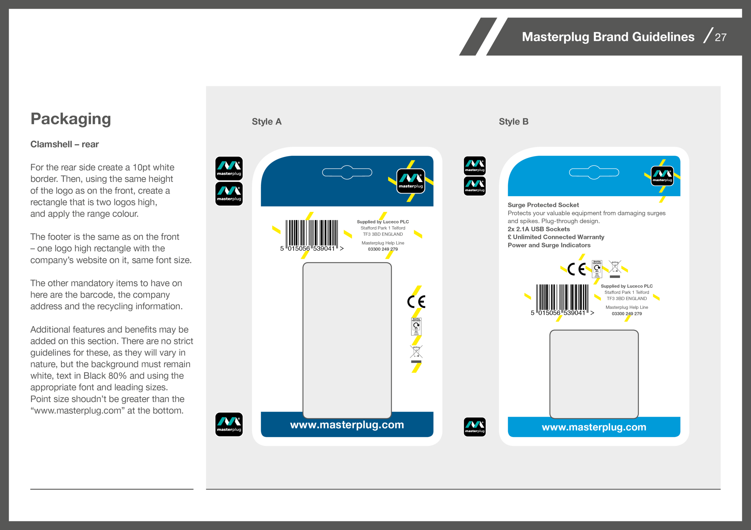
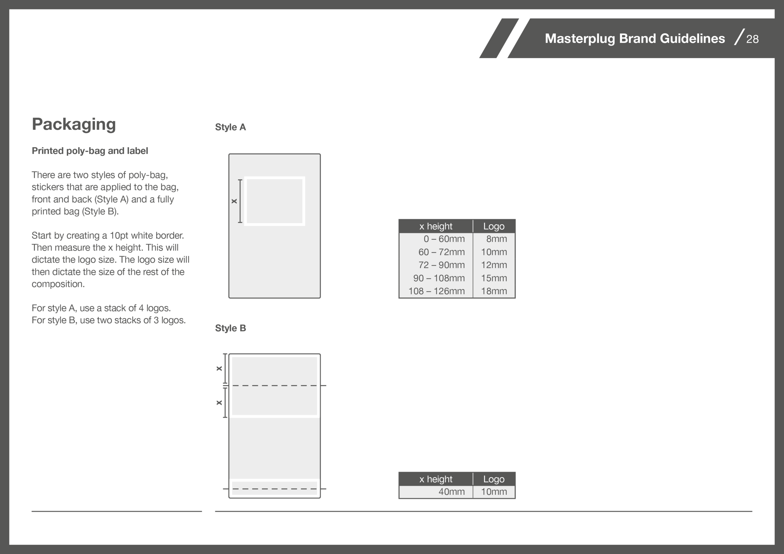
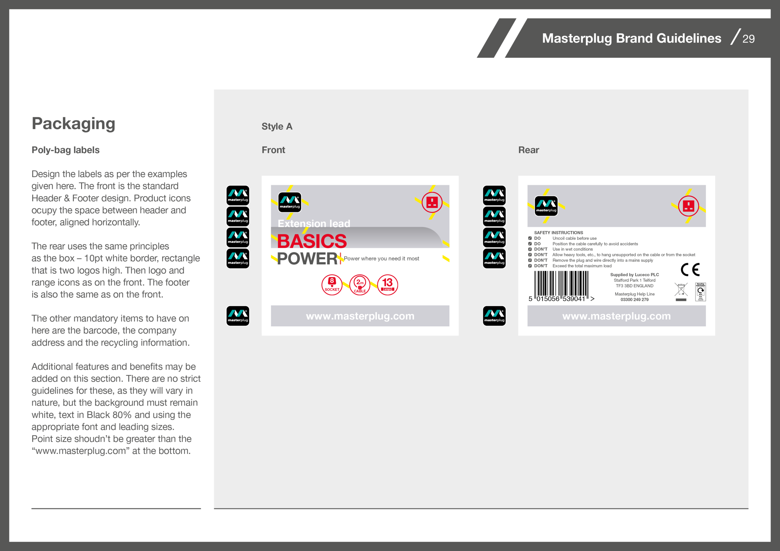
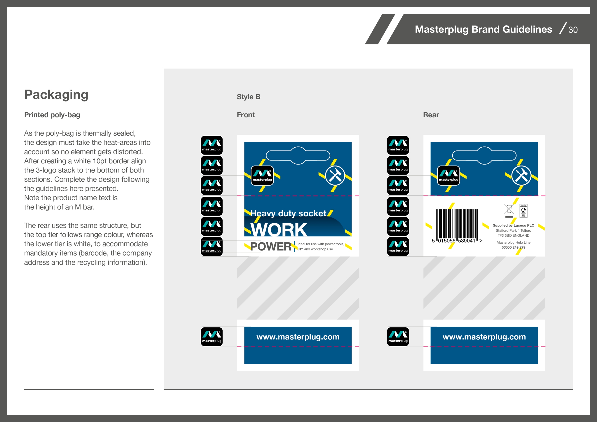
Packaging
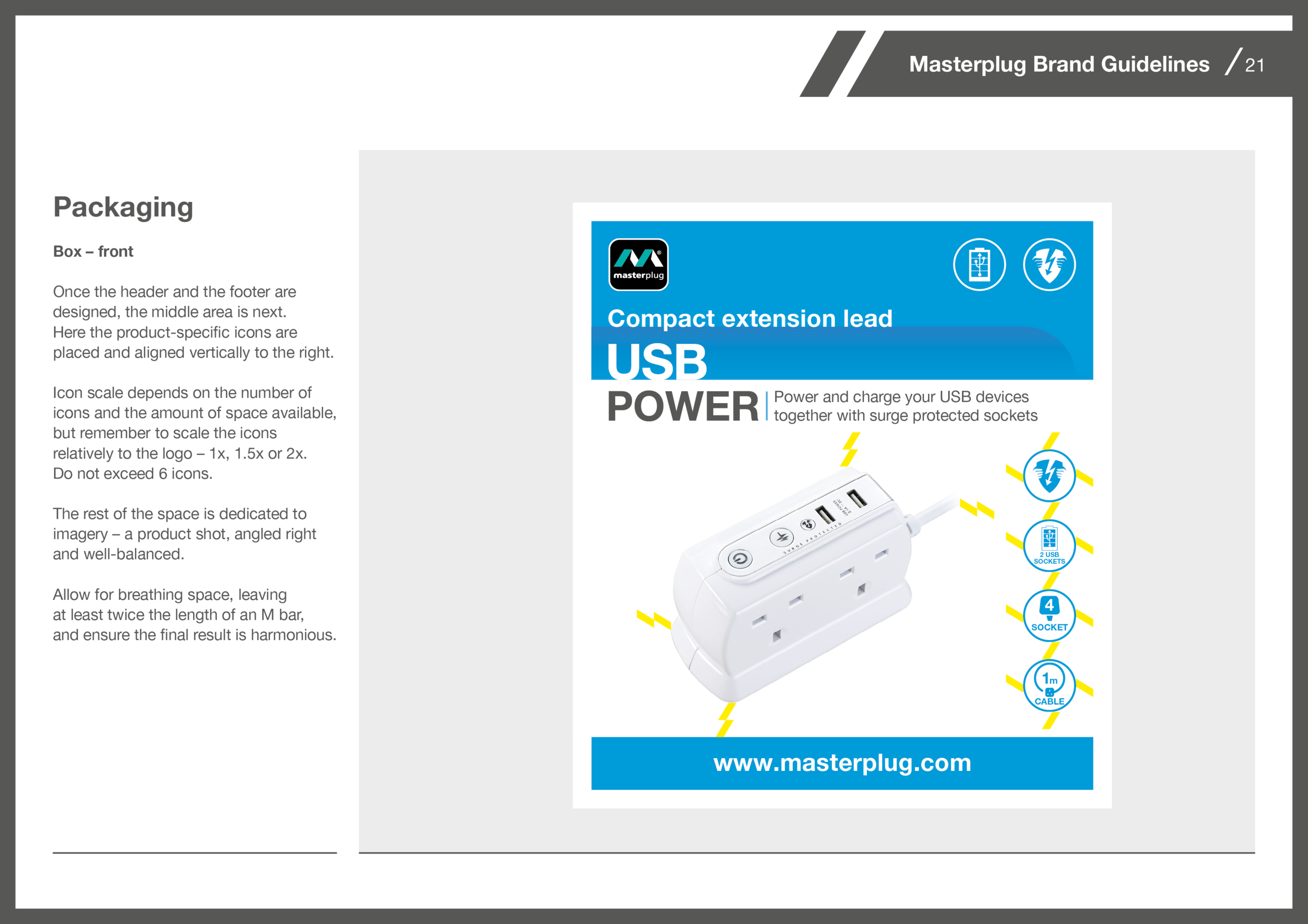
Packaging was the greates challenge. Masterplug has a vast catalogue of products, and although concepts are developed in London, the artwork is then implemented by the team in China.
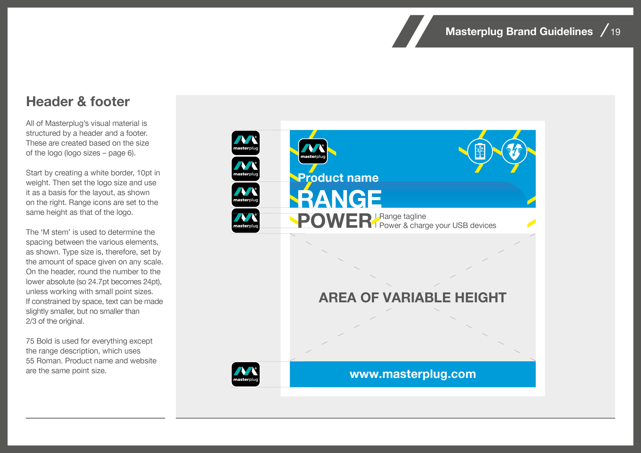
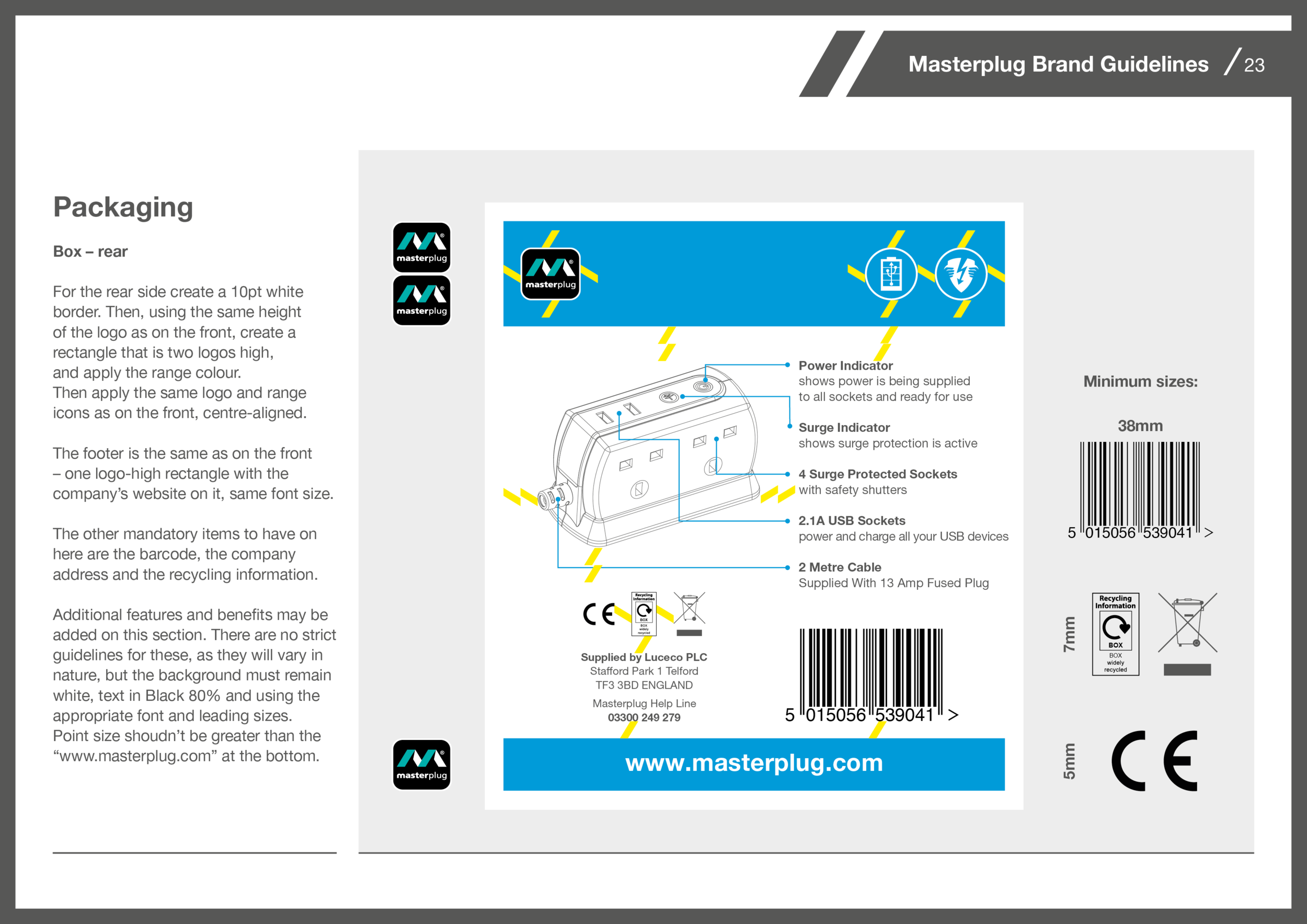
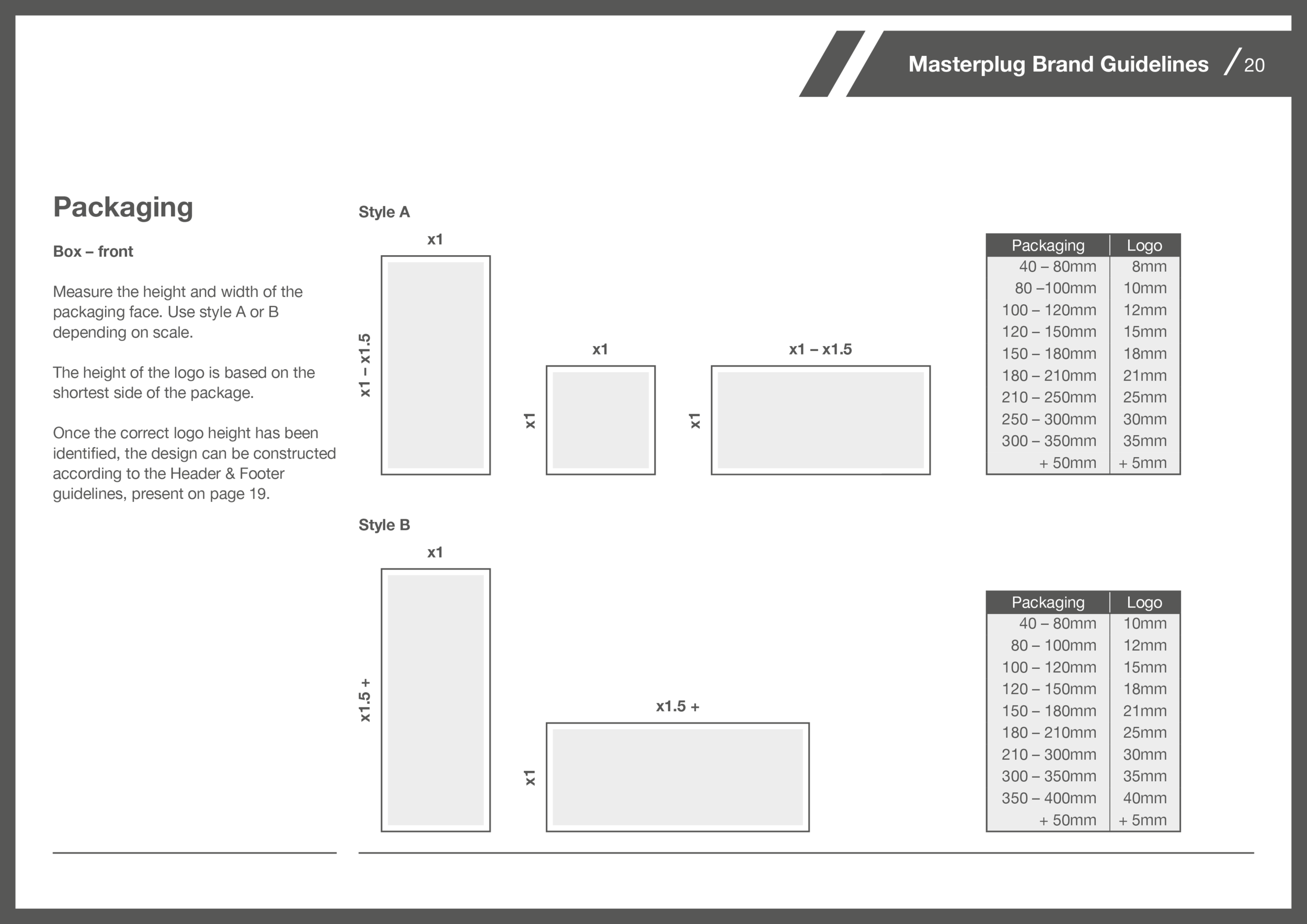
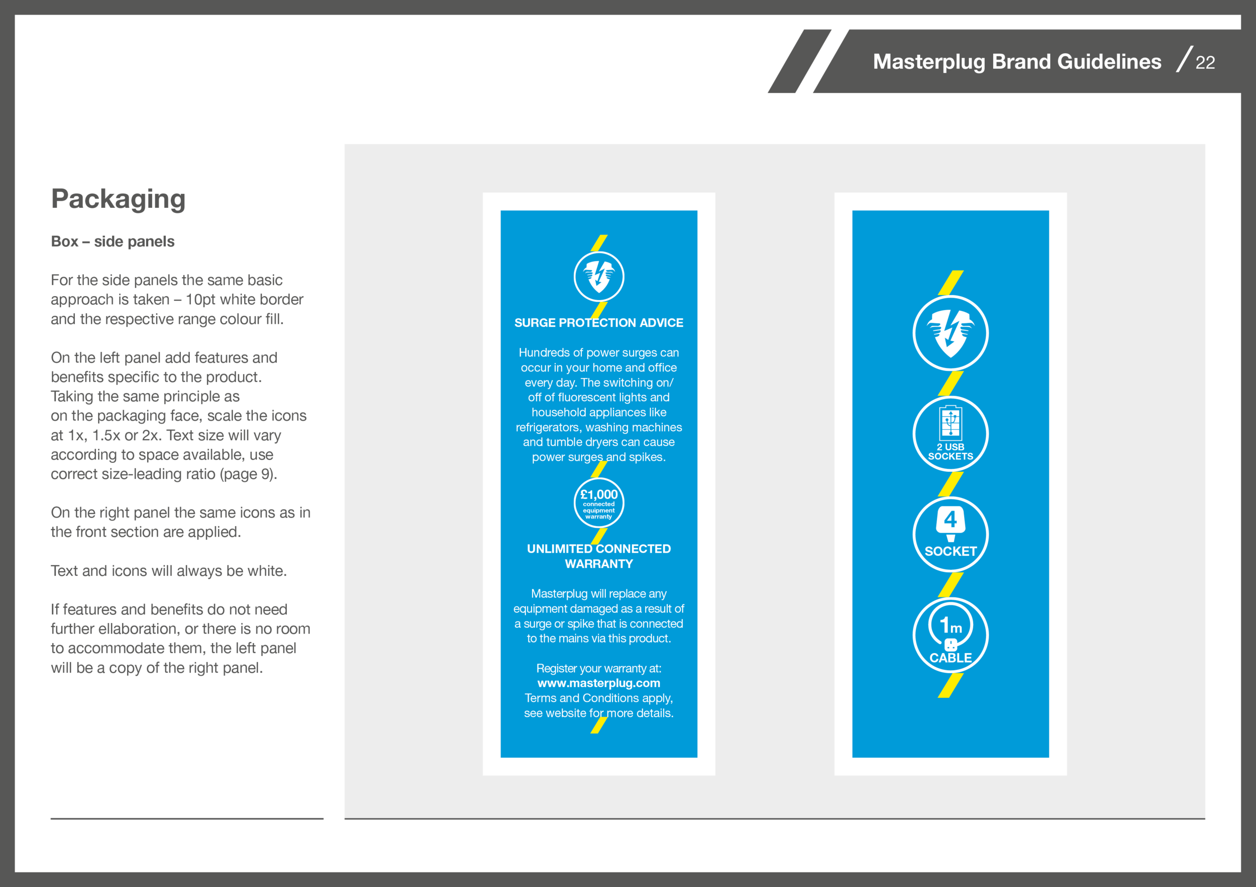
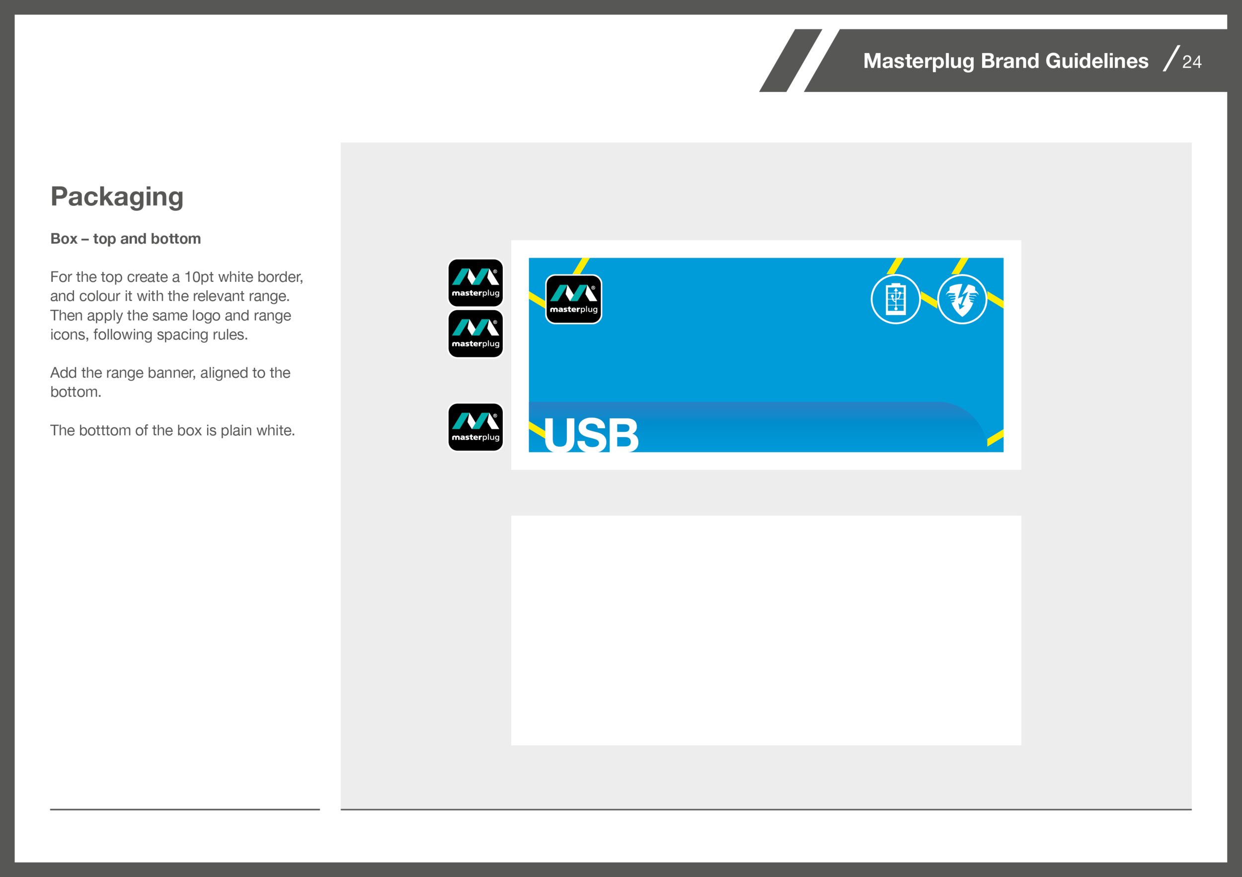
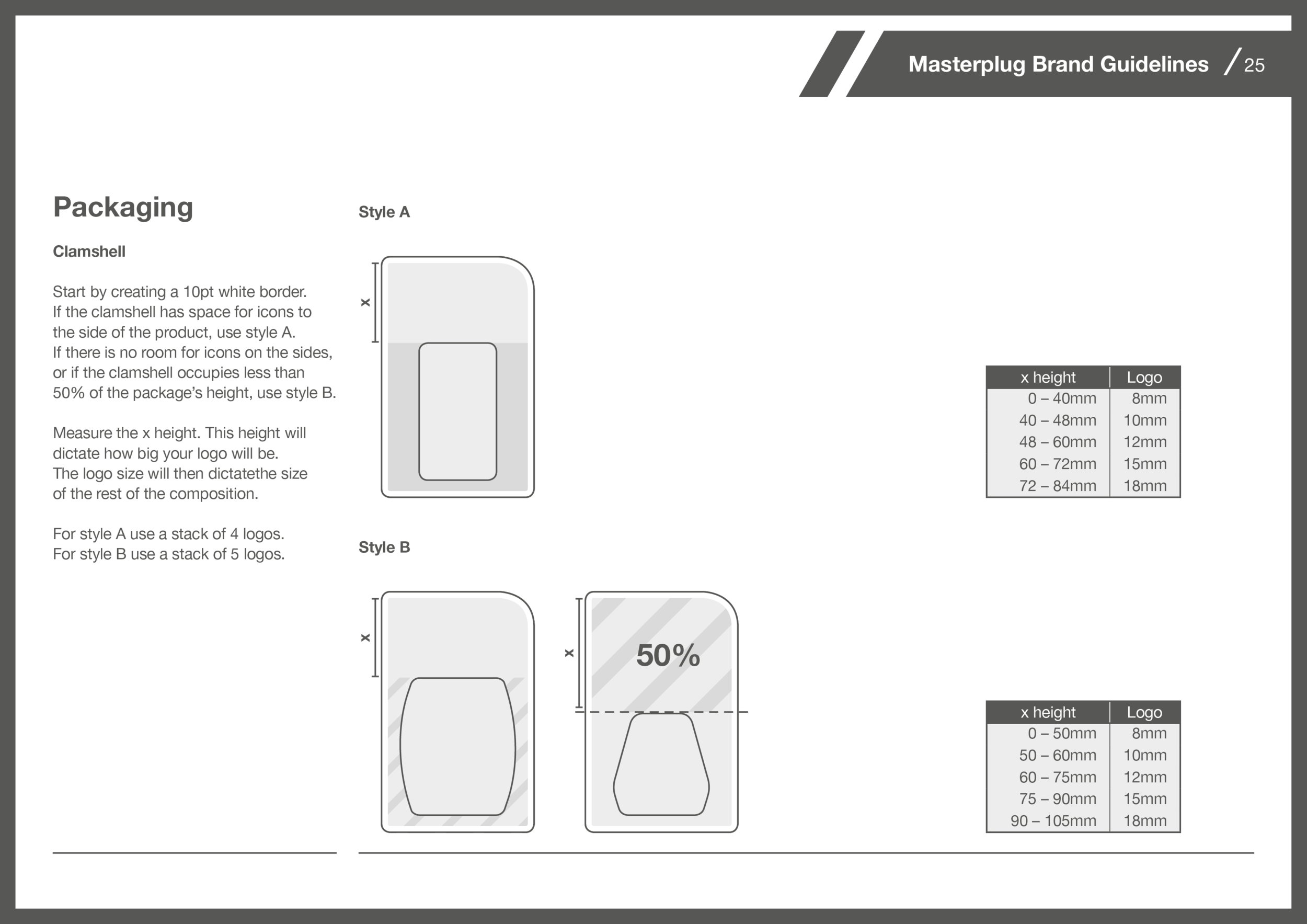
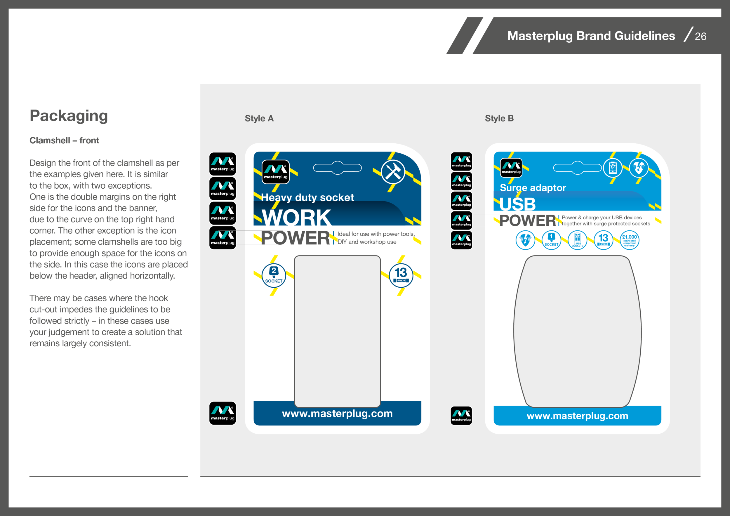
I developed a set of guidelines which scale depending on the size of the packages. The size of the package dictates the size of the logo, which then provides a guide for all other elements. This way all elements follow a simple logic, and their positioning remains consistent.


